Pages

Friday, March 25, 2011

Sometimes It's All In Their Mouth

Taste. Some people have it and some don't. Same goes for class and style.


Tonight I've read a blog post by a fellow Canadian Design Blogger that saddens me. It is in a round about way bashing a Designer yet they have no first hand knowledge of what transpired. Sometimes being pseudo-anonymous behind a blog makes it's easy to natter away about others when it doesn't involve them and they were not privy to the situation. 


Here is the blog post doing this currently about a female Canadian Designer who is allegedly famous and on HGTV. So obviously NOT me, I'm neither famous nor on HGTV...although I'd be open to both opportunities.


The problem is this:  the story is told from the 3rd person perspective and important details are conveniently ignored left out yet it is rather vicious and seems to decide the Decorator was an overbearing monster.


It was also sad to see the name calling of some successful designers and the innuendos as to who it could be that so wronged the clients. Honestly, I think there is far more to the story than the clients are willing to admit. 


I was going to right a comment on the blog post but decided I'd post my response below:

It's always sad to hear clients are not happy with the service BUT I have a big problem with this story. If this was the 'big name' Decorator that it suggests there is no way the client would not have known the sofa was going to be beige. 


The client would HAVE to sign off on the fabric for the sofa and place a deposit before it was purchased by the designer. They would have been given detailed invoicing for the time spent and what the time was spent on. They would have known the hourly rates as they would have been in the contract. 


There are so many flaws to the story even if some details where left out.


This sounds fishy to me. Perhaps it was not such a 'big name' decorator. There are some pretty crappy ones on TV but there is no way the handful of top Designers nor Decorators in Toronto would work the way these clients did with their decorator. 


There is nothing wrong with the prices they paid. For example the quality of the roman blinds are excellent. I always choke when I get the quotes from the workroom for drapery. When a client is willing to invest this kind of money they are not looking to get some drapery from InVu let alone from HomeSense or Bouclair.


I'd love to see what the decor looked like after the reveal rather than the after...after...photos.


P.S. Someone mentioned this is not TV so why the Reveal: 
1. so the furniture, drapery etc is delivered and installed all at once therefore saving the client multiple delivery charges.
2. so the items don't get damaged, by pets, kids, etc. before the install.
3. so the client gets the WOW they are paying for!
4. items can take weeks to months to arrive so rather than having the client disrupt their lives multiple times and have missed deliveries or who knows what that can go wrong it is done in one fell swoop. AKA the reveal.


*sigh* I gotta go look at some pretty blue bedrooms to feel better.

Monday, March 7, 2011

More Large Scale Graphics for Walls

In December I did a series of posts on my 2011 Trend Predictions. It was in Part 2 of the series I predicted large scale graphics on walls as murals and wallpaper.

I love when I can say I was right! My memory is not the steel trap it used to be so I can't generally say that to Steve anymore so please bear with me...I'm going to shout it here :)

I saw a post on Tom Scheerer over on Chinoiserie Chic and my heart skipped a beat. Tom's remake of the Main Club at Lyford Cay in the Bahamas has the most outstanding wall murals (or is it wallpaper?) I've seen in some time. I'm head over heels for it. 

Take a peek mes petit choux!


Is there nothing Tom can't do? Stunning!


Sunday, March 6, 2011

Kitchen Inspiration Provided By Design Tweeters

You never know where or when inspiration will come to you. Recently I've been hearing Bijou & Boheme & Toronto Interior Designer phenom Meredith Heron tweeting about Christine's kitchen design Meredith is doing. It has peaked my interest and unexpectedly helped me with my stalled inspiration for my own kitchen. #Win ;)


I knew I wanted White marble but that was the only thing I was sure of. Did I want gray, white or black cabinets? Did I want modern or traditional doors? Did I really want the organic wood trend in my kitchen or was it just an infatuation?


Truth be told I've dreamed about kitchens for the last 2 nights. A Hodge Podge of kitchens and excited chatter with Christine & Meredith. Hmmm, sounds like Twitter has influenced my dream style. I blame Christine and Meredith and thank them as well for unwittingly being my design muses. 


So what have I decided? 30's chic inspired baby! Behold my inspiration photos:


Baba, stylist extraordinaire has a 20's, 30's style I greatly admire and Miles Redd has a kitchen I salivate over.


My decisions:

  1. Traditional cabinet doors.
  2. Custom high gloss painted cabinets in black(ish).
  3. Backsplash should have a matted sparkle (does this make sense) like Baba's gold lame' blouse or solid bangle. I'm thinking Rocky Mountain Hardware tile backsplash.
  4. Light fixtures will be a warm metal finish.
  5. Faucets should evoke the flow of the dress in the first image. source unknown
  6. Marble will have the 'hand' (tactile feel) of the dress.
Kitchen design, I've concluded will be by Carol Reed Design (I do not have the experience designing kitchen layouts and Carol does exceptional kitchens. Some day I'll formally request her expertise!

Now, cash flow is all that's holding me back. PR firms...make your pitches ;)

Saturday, March 5, 2011

It's all in the architectural details

At first blush this entrance hall looks so simple. Stunning but simple.

McGill Design Group

It is deceptively simple looking. Seems easy to achieve doesn't it? But look closely. This room is a study in details; look at the architectural detailing. From the wall paneling to the deep baseboards and appropriately deep crown molding. 

What makes this entrance stunningly warm and inviting is the layering of clean and simple furnishings over the formal, traditional details of the home. Imagine the walls bare with only standard baseboard and crown molding. The room would look cold, bare and unfinished...as if something were missing. 

Architectural details can not be overlooked. When you are considering decorating a room start with the walls themselves and build upon the architectural details you add. The furniture is one of the last things you need to think about. Almost an after thought.

I love :
  • The Robert Abbey semi-flush fixture, called 'Bling', just visible at the top of the photo. It's on my list for the atrocious home we are in. 
  • The contemporary wall sconces are lovely and almost unexpected in an entrance foyer.
  • The millwork...on my list. It will run up the stairwell, as in this photo and throughout the 2nd floor hall. 
  • These dark stained treads draw your eyes up the stairs and give a greater sense of depth to the entrance. Again, on my list. We have 'honey' oak stained stairs. Hideous!
  • Hardwood floor, natch. We have 12'x12' ivory ceramic tile covering about 1/2 of our main floor...I'm so embarrassed! And my little piggy's are always freezing! 
For the suburbanites in the cookie cutter homes many of us live in this single photo is an excellent example of a jumping off point to take your blah builder basic to a show stopping shelter mag worthy home. Put the builder's model homes to shame! Show the builders and neighbours (I'm Canadian, eh.) how it should be done. 
  • As the nosey parker that I am I love that the mirror allows us to see in to the kitchen. Wouldn't you just love to live here? Nothing is over done it is simply...perfection.
For the modest investment of cash and a couple of weekends of work for 2 you will always be excited for the moment you walk in the door. Sure wallpaper would look fabulous but will it appeal to a future buyer? Not likely. Wallpaper would cost about as much as the millwork but would date your home and potentially reduce the value...unlike this home. 

Sophisticated never goes out of style.

Friday, March 4, 2011

It had me at Yello

I love the yellow as the accent color to this brown palette. The ceiling sort of rounds out the room yet is unexpected...completes it don't you think?


Yellow, corresponding with earth, is considered the most beautiful color. The Chinese saying, Yellow generates Yin and Yang, implies that yellow is the center of everything. Associated with but ranked above brown, yellow signifies neutrality and good luck. Yellow is sometimes paired with red in place of gold.
Yellow also represents freedom from worldly cares and is thus esteemed in Buddhism. - via Wikipedia

via Nuevo Estilo

A little sunshine to brighten your day while we wait for spring.


Monday, February 28, 2011

Colette as inspiration

I really must read some of Sidonie-Gabrielle Colette's novels. I was shocked to realize I've not read Gigi. It's been on my list for years. Not sure what I've been waiting for...unless it's an iPad? Hint hint DH!


In honor of the approaching spring, Paris in spring, and Pantone's color of the year, Honeysuckle, I present to you Colette. Colette's life is deserving of a movie a la Henry & June and Frida.


Colette by Jacque Humbert 
I think I'll do a design board using the Humbert painting of Colette with a nod to her Parisian boundary pushing lifestyle!


French Interior designer Jacques Grange purchased Colette's apartment at the Palais-Royal in Paris just a skip across Rue Saint-Honore and Rue de Rivoli to Place du Louvre.


Bedroom view over the gardens. *Swooning* The walls are covered in woven horse hair!
Of course when I was in Paris I had no idea who Jacque Grange and Colette where nor did I care about seeing the Palais-Royal. I only wanted to walk the streets of Paris and try to remember the sights, sounds and smells. Paris was wasted on me. I was far too young to get much meaningful out of the trip...other than a love of crepes the desire to go back someday!


A little dab will do you. Dabble Mag is live!

Kimberly Seldon's highly anticipated Design and Lifestyle on line magazine 'Dabble' has gone live this morning at 9:30 eastern . 

If you have not subscribed to receive your copy, here is the link. Each issue we get to travel the world with one of the top residential designers in North America! 

Sneak Peak:

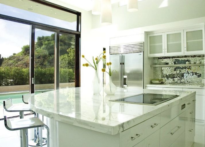
Stunning white kitchen by California's Erinn Valencich. 


That backsplash is to die for. It finishes the kitchen off powerfully - calm, clean and radiant!


From Design to international food and art each issue of Dabble will inspire you I'm sure as there is something for just about everyone.


David Carter's 'opium' den! I love the hits of vibrant red in the green paneled room.


There is so much more in the premier edition of Dabble...just waiting for you to turn the pages. 


P.S. 


Wholly Guacamole Kimberly Seldon looks a lot like me in this picture:
Kimberly Seldon seated between Lena Diaz and Nyla Free enjoying a gourmet Popsicle from Las Paletas in Nashville, TN.
This is me and The Girl at Christmas.