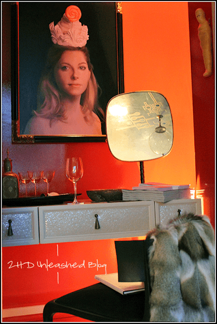
The main space had a daybed with occasional tables around it and the closet in the room was made in to a nook to do makeup...or serve drinks...sort of; which I'll explain soon.
There was nothing functional to convey this was a study. The daybed made it feel like was designed for occasional guests to sleep over but there was nothing functioning to hold or place 'study' type things like bookcases/etageres etc. for books, files and no workspace for a laptop.
There was a desk in the closet but it was styled for doing makeup, well it had a small mirror but then it also had a tray with aperitif crystal glasses and what looked like a decorative dispensor. As odd as the styling was, it was not at all suitable for doing makeup (inadequate lighting...an uplight...and red paint in the closet).
The room seemed it should be off of an ensuite bathroom or closet.
There was also the drapery which made the room unbalanced. They were beautiful lined golden dupioni silk but the left side of the room had them wrapping around a bulkhead, so at least 3 panels wide; however they were not meant to be closed. Then on the right side there was one panel which was not to be closed.
Although the study had some really beautiful elements it fell short on meeting the design requirements. The other rooms in the apartment where cohesive and displayed a personality type that was very much *not* like the person Sara created the study for. So I was disappointed with the study.
However, do not take my word for it. Below are photos I took so you can decide for yourself. Please, let us know your thoughts! Yes, I'm *that* close to begging for comments ;)


Well it all certainly looks pretty but I'll take your word for it as to functionality- enjoyed reading your thoughts on the whole thing!
ReplyDelete